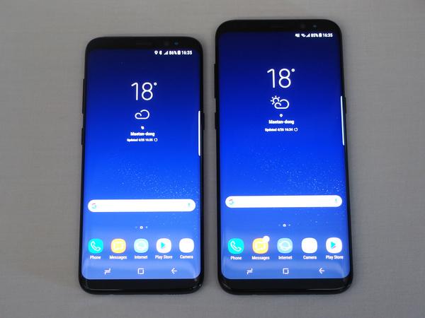
Samsung's Galaxy S8/S8+, which has begun to be released globally and is already gaining popularity. It is a model that further brushes up the essence of the conventional Galaxy S series, such as adopting a vertically long and slim display and a beautiful symmetrical design from the side to the back. We interviewed the developers at Samsung Electronics headquarters in Suwon, South Korea about how the Galaxy S8 / S8+ was born.
“Galaxy S8” and “Galaxy S8+” released globally
Infinity Display Realizes Infinite Possibilities I was worried about the abolition of the home button until the end
First of all, about the reason for adopting a vertically long display that cannot be seen in smartphones from other companies. According to Choi Seung-min (senior professional) of Samsung Electronics' global product planning group, "First, I thought about creating a new model of the Galaxy S series."
The design concept of Galaxy S8/S8+ is "Infinity Display". It is said that the aim was to create a smartphone that transcends existing frameworks and realizes infinite possibilities.
Looking back at the past Galaxy S series, the Galaxy S6/S6 edge, which was introduced two years ago, was a full model change product that redesigned the previous model. And one year ago, the Galaxy S7 / S7 edge, which received high praise from users for the S6 series, kept the design concept as it was and enhanced its functions, such as making it possible to use microSD cards.
Galaxy S8/S8+ is the second year of the S6 series, and users have been asking for new products. Now every smartphone has a similar design. It seems that development started from the question of what to do to realize a design that has never existed before.
Mr. Choi Seung-min (left) and Ms. Yang Hyun-young (right), senior professionals in the global product planning group
What do you do to change the appearance? One of the answers was the user need, 'I want a larger screen while keeping the size of the current terminal.'
Nowadays, everyone watches videos on smartphones, but in order to make 21:9 Hollywood movie content easier to see, it is advantageous to change the aspect ratio from 16:9 to a wider size. It was concluded. On top of that, it was decided to adopt an elongated display with an aspect ratio of 18.5:9.
According to Choi, this type of display will become mainstream in the market in the future.
In addition to movies, it is said that vertical or horizontal smartphone displays are becoming a trend, such as the “list view” style for viewing SNS timelines. Moreover, with this shape, it is possible to achieve both a large screen and ease of holding.
However, I am a little worried about the strength of the display. The Galaxy S8/S8+ has an almost bezelless design.
Regarding this, Mr. Choi said, ``It maintains the same strength as the existing terminal, and the strength is increased by adopting Gorilla Glass 5. Furthermore, the edge part is also coated with a special coating.'' Rather, it is easier to hold than previous models, so worry about dropping will be reduced.
On the other hand, the home button, which can be said to be the "face" of the Galaxy S series, has been abolished. Regarding this point, Mr. Choi said, "I was wondering whether to abolish it until the end."
However, it is said that a pressure sensor is built in the lower center of the display instead of a soft key, and the usability as a home button is the same as that of the previous model.
The home button has a pressure sensor embedded in the bottom center of the display
A design that focuses on "seeing" is a necessity in today's world
Samsung's Product Design Group 1 is in charge of the basic concept behind this body design. According to Yunjin Kim (senior designer), the design of the base design was born from the results of researching design trends in Samsung's design centers and markets in each country.

According to that, the current era is "overwhelmed with things and information, and people are looking for light and pure, which has nothing".
Nowadays, information transmission has developed, and there is no sense of physical distance in terms of information sharing. Gap between gender, age and race is disappearing.
From this background, we considered the design philosophy of the new product to be "Neutrality", that is, balance, and we came up with a design that is easy for all users to use.
Product Design Group 1, Senior Designer Yunjin Kim (left) and Hyejin Bang (right)
A smartphone is essentially a device that displays information on a display. Ease of use is the pursuit of its essence, and the display surface is designed so that you can concentrate on "looking at it."
The vertical space above and below the 16:9 screen and the home button should not be considered as a display device. You can immerse yourself in the display by making the sensors around the camera as inconspicuous as possible.
And it's easy to hold when you hold it in your hand, which is also important. More than 100 prototypes were made to create a final product, such as a shape that draws a gentle curve toward the sides and a metal material on the side and the glass material of the display that are integrated without any gaps to enhance the grip. You have decided on the shape.
According to Mr. Bang Hye-jin (senior designer), in order to achieve a symmetrical balance in the cross-section of the main body, we combined two materials into one with the concept of liquid shade to realize the depth of the material. It's called. The finish that makes water flow is the “Infinity Display” itself, which is the design concept of the Galaxy S8/S8+.
Both beauty and ease of holding with a design that makes water flow
Galaxy S8 comes in 5 color variations.Additional colors such as interesting pink are "considered by the market"
In addition, the main body color of Galaxy S8/S8+ is also a unique shade that considers harmony. It is Five colors are planned to be developed: Midnight Black, which emphasizes unity, Arctic Silver, which looks like flowing water, Coral Blue, which reanalyzes the color of blue, Orchid Gray, which is a subdued color, and Maple Gold. increase.
Of these, Orchid Gray is a unique finish that adds purple to calm gray. Calming, mysterious, and trendy, this color is also a finish that women long for, and it will be adopted as Samsung's unique color in the future.
In addition, the past model added a pink color variation later. The reason why the S8/S8+ didn't start with pink is because there are parts that don't match the design philosophy of this model. However, if there is market demand, additional colors are also being considered.
The main body color is calm with the image of harmony.
Designed with usability first, 3.5mm jack and enhanced camera functions
By the way, there is a 3.5mm headphone jack at the bottom of the main unit. Considering harmony and new metric design, it seems that this part should be abolished.
However, according to Mr. Kim, usability was the first consideration. Rather, we believe that the abolition of the headphone terminal will spoil the usability of the terminal for users.
By the way, past models came in two shapes, an edge display and a standard display. However, the Galaxy S8/S8+ prioritizes large screens, and there is also a need for compact sizes in the market, so both adopt edge displays.
In addition, Mr. Yang Hyun-yong (Senior Professional) of the Global Product Planning Group explained that the safety design has been further strengthened.
Finally about the camera. It doesn't look like there are any major changes from the Galaxy S7 series, but according to Mr. Choi, the Galaxy S8/S8+ has improved performance by adding a multi-frame shooting function and enhancing shooting in dark scenes.
In addition, regarding the adoption of the dual camera, as a result of considering whether it was necessary to take the most beautiful photos, it was decided not to adopt it this time.
The front camera has improved image quality. Enhanced rear camera performance
And for the selfie function, which is becoming popular recently, the front camera has been increased from 5 million pixels to 8 million pixels. In addition, it is said that the sticker function is installed as standard so that selfies can be enjoyed immediately after purchase without having to install an app later.
The design of the Galaxy S8/S8+ was born from anticipation of user needs trends and ease of use, and has achieved a high level of usability that has never been seen before in smartphones.
Since it is the first flagship model in a year, it can be said that all of Samsung's development capabilities have been put into the product. It can be said that it is the product that attracts the most attention in this spring/summer model.

![Lenovo's 8.8 inch one-handed tab "Legion Y700" full specs released! [Is the price in the 40,000 yen range?]](https://website-google-hk.oss-cn-hongkong.aliyuncs.com/drawing/article_results_9/2022/3/9/207e1be231154e91f34c85b4b1d2126c_0.jpeg)
![EVsmart blog Toyota's electric car "bZ4X" that makes you feel comfortable with electric cars and quick chargers / No% display of battery level [Editorial department] Popular articles Recent posts Category](https://website-google-hk.oss-cn-hongkong.aliyuncs.com/drawing/article_results_9/2022/3/9/752542064665dc2bd7addbc87a655694_0.jpeg)

